The Keys to Creating an Inviting Laundromat Storefront
The success of any laundromat extends well beyond the performance and efficiency of its equipment – and it begins even before that first customer tosses that first load of clothes into one of your washers.
In fact, your storefront is often the first point of contact and actually plays a crucial role in attracting and retaining customers for your business. As a result, we’ve gathered numerous insights and tips from experienced laundromat owners and industry experts who shared their perspectives on creating an inviting and functional retail laundry storefront.
From color schemes to parking considerations, lighting, and branding, these insiders emphasize the importance of a well-designed exterior in building customer loyalty and drawing in new business. Whether it’s achieving a small-town charm in a New England setting or embracing a modern aesthetic in a bustling city, each owner offers valuable advice for fellow store operators looking to make a lasting impression on their customers.
Bruce Rocha Sr.
Mattapoisett Laundromat
Mattapoisett, Mass.
Your storefront is very important. Customers will take ownership of their laundromat – and, when it looks good, they’ll talk it up to their friends, which draws more business.
Also, when customers are proud of “their laundromat,” they’re willing to pay more because they feel better doing their laundry in an attractive store.
Our laundromat is located in a small New England town, and the store blends in with the homes nearby. We have cottage-style windows, like the homes in the area, and this give our customers a warm feeling like they doing laundry at home.
Of course, good lighting is essential to attracting customers after sundown.
I’ve learned that color schemes will speak instantly to prospective customers. For instance, if you’re in a fast-paced community, bright colors may give the allusion of fast, perhaps low-cost service – while lighter colors with accents of blue and or green will attract customers who want a clean, environmentally conscience laundromat with a more relaxing experience, and who also may be less price-sensitive.
With our exterior façade, we’ve tried to achieve a warm, friendly, small-town feeling, where you can meet up your friends while doing your laundry. Plus, our entrance doors are electrically operated so that customers can walk in without putting down their baskets or bags full of laundry.
Additionally, we feature a covered entrance, which offers our customers a bit of protection from the elements.
Our parking is located in front, so our customers can always judge how busy we are, and they can park their vehicles relatively close to the front doors.
Design Tips: We have a small garden with flowers and shrubs to give the laundromat a more homey feeling. Our parking lot has clearly designated parking spots that are 10-feet wide, so customers can easily walk between parked cars with full baskets of clothes, as well as load or unload their vehicles without bumping into the car beside them.
In addition, we have signage stating our services – laundromat, wash-dry-fold, and drycleaning – in bold lettering on the frieze board along the front of the building. There is no question as to what services we provide.
Best Advice for Other Laundry Owners: If your skill is being an entrepreneur or running a laundry business, stick to what you’re good at – and hire an architect to design your storefront. It may be the best investment you ever make. You only pay once, but that good design will remain a permanent investment.
Bob Eisenberg
BFE Consulting Group, LLC
Blue Bell, Pa.
Like any other retail business, it’s critical to have an attractive front window and sign. Those passing by need to know immediately that your business is a laundromat. However, be careful not to block too much of the front window with signage and décor, because visibility into and out from your store is important for safety issues.
A scrolling LED display will get customers’ attention and take up only a small portion of the front window, and can serve as an important marketing tool to help showcase your services and specials.
No doubt, lighting is critical for safety of your customers. Don’t try to “create a mood” with your storefront lighting. Instead, seek to convey a safe, inviting environment for customers and their families.
It’s always optimal to have electric double doors at your entrance for customer convenience. Parking availability up front also is preferable over parking behind a fire lane, for safety reasons and ease of ingress and leaving afterward.
All in all, today’s modern laundromats are bigger, brighter, and more professional-looking and inviting than ever before. But, often, it can take more thought than money to create an appealing laundry storefront. So, take your time to do it right.
Design Tips: Get professional signage from a quality sign company. Nothing screams “Mom and Pop” like handwritten signs. You don’t need many, but make sure one of them says, “Welcome.”
Incorporate common colors within the storefront, and perhaps integrate a professional-looking logo onto window and signage designs. However, it’s more important that customers know what your business does, rather than its specific name.
Best Advice for Other Laundry Owners: Walk out of your store, go into the parking lot, turn around, and look at your laundromat as if for the first time. Then, ask yourself, “Would I use this store?” Sometimes the answer can be surprising – some owners can get to a point where they can’t see the forest for the trees.
Holly McKinney
Local Spin Laundromat
Panama City, Fla.
First impressions are everything. Customers will make their initial assessment of your laundry before they even walk through your front door.
First and foremost is cleanliness, which can be achieved under any budget – and it starts outside with your storefront. People will not feel comfortable if they notice debris on the ground, along with dirty trash cans and dirty outdoor seating. A fresh coat of exterior paint or a good powerwashing will instantly make for a more inviting storefront.
Lighting is essential, and the more the better – no one enjoys patronizing a dark, shadowy business.
Color schemes attract the eye. We chose a neutral palette with “pops” of fun, consistent, coordinating colors. Also, you definitely can have some fun with signage to catch the public’s eye. We live in a world where people are used to seeing a logo-type of signage.
At our business, we wanted to create an environment where customers didn’t mind spending time doing a task they probably don’t real feel like doing. To achieve this, we included various outdoor seating options, including a picnic bench with an umbrella, as well as plenty of trash and cigarette receptacles (which are tended to throughout the day).
We also incorporate window paintings and customized window clings during the holidays. And we’ve installed an automatic front door, which our customers enjoy because of the convenience.
Clean, uncomplicated design with clear signage seems to be the trend. I notice a lot of neutral-colored buildings with brightly colored signage that catches the eye.
Design Tips: I will always say that cleanliness is the easiest and most cost-effective strategy you can undertake. Put a fresh coat of paint on your building, and don’t be afraid to have some fun with color. Also, some local businesses here have hired artists to paint murals on their buildings, which livens them up and adds beauty to the store and community.
As far as branding, definitely create a logo or an icon, and use it in all your signage, as well as all of your other messaging.
Best Advice for Other Laundry Owners: I try to create an environment that I personally would feel comfortable in. Be constantly observant of all public spaces and businesses, and take notes on what you like or don’t like about each particular space. If you do that, you can honestly evaluate your own outdoor space and incorporate any other elements you think might improve or enhance your storefront.
Sharon Brinks
The Laundry Station
Wichita, Kan.
Imagine a potential customer driving or walking past your laundromat. What would be their very important first impression? Would it give the appearance of a place where they would feel safe, be able to easily enter and exit, and could actually leave with clean laundry?
That was my goal when we built The Laundry Station. We built the store from the ground up, and during the design process it was important to me for it to feel welcoming and safe for everyone, but especially for our primary target customers – women doing the weekly laundry for their families.
Here are some key storefront features that are important to me, and why:
Easy Entry – There’s no curb to trip on, so access to the business is easy for children, the elderly, individuals on crutches or in wheelchairs, the sight-impaired, and those using laundry carts and baskets.
Automatic Doors – Customer’s hands are full – perhaps a laundry basket in one hand and holding a child’s hand with the other. Both of our customer entry doors are automatic.
Storefront Parking – Again, it’s about easy entry, and not requiring our customers to walk the length of a large parking lot to get to us.
Extra-Wide Parking Spaces – You can open your car door all the way, so it’s easy to get people and laundry loads in and out of vehicles without fear of door dents. If you’ve ever had to wrestle small children in and out of car seats, you know how important this can be. We sacrificed a few parking spaces, but making them bigger was worth it.
Extra-Wide Sidewalk – This keeps vehicles at a safe distance from the building and gives plenty of walking room between the store and the cars.
Covered Entries – This feature keeps the weather at bay when our customers are entering or exiting the store.
Window Signage – This showcases our amenities before new customers enter, and because it features our signature blue color, it evokes a feeling of comfort and familiarity. We also have window signage that features our store hours, address, phone number, animal policy, trespassing policy, and notice of recording in progress.
Full Length Windows (And Lots of Them!) – Customers can clearly see inside without even getting out of their vehicles. Is this a clean place? Does it look safe? Natural daylight is comforting, and keeping those windows spotless is crucial.
LED Exterior Lighting – When we were building our store, I told the electrician that I wanted the parking lot and the exterior of the building lit up like Christmas at night, and he did not disappoint.
Parking Lot and Landscaping – Keep the parking lot and sidewalk trash picked up, even if you’re a tenant. (This includes cigarette butts on the sidewalk). And, if you own the property, keep the grass cut and the landscaping decently manicured and healthy. It doesn’t have to look like a five-star resort, but it shouldn’t look like a toxic waste dump either.
Best Advice for Other Laundry Owners: Create a storefront that’s clean, safe, and inviting. Customers need to feel welcomed and appreciated when they enter your store to spend their money with you. Give them the best first impression possible.
Beck Miller
LaundroLab
Charlotte, N.C.
Your storefront is often the first impression customers have of your location. It’s imperative to present a clean, welcoming, and inviting environment so that customers feel confident in their decision to use your laundromat.
In general, you want your store to look clean. After all, customers come in to clean their clothes. They don’t want to go into a business that feels dirty from the jump. Fresh paint, signage, windows, and so on are all table stakes.
Although it’s preferred to have parking upfront, you can absolutely work around it, with loading and unloading areas and great customer service.
Design Tips: Paint is the quickest and easiest option. Getting permission from your landlord to paint the building exterior with your brand colors is a fast and effective win for laundromat owners looking to refresh their businesses.
Best Advice for Other Laundry Owners: Make certain that your branding, color scheme, decorations, etc. are all cohesive with your brand. Of course, to incorporate brand identity, there has to be a brand identity. It’s common to see stores that have changed ownership a few times with bits and pieces of past brands still present. It’s important to refresh these over time to be sure the laundromat gives off a singular identity.
Patrick Dreis
Empire Laundry
Corona, Calif.
Customers have choices about where they do their laundry. Don’t give them an easy reason to go elsewhere.
With regard to laundry storefronts, I prefer parking right up front, because it makes life so much easier for the customers. In fact, I’ve passed on buying stores because they either didn’t have good customer access or had difficult parking lots.
I like painted windows, and I use a professional artist to do that painting. If you can get your landlord to install new signage, do it; with LED illumination, it may even save some money, versus older signage.
I’m also seeing more and more digital signage. With the prices of large screens going down, I see opportunities here for laundry owners.
Personally, I think branding is overrated in this business. To me, it’s more about location and store quality. I don’t think customers care very much about silly laundry names on your storefront.
Best Advice for Other Laundry Owners: Try approaching the front of your laundromat as a customer. Park, look closely at the entire storefront, go inside, get a laundry cart, load it up, and wheel it in. And think about ways to make the process easier and more welcoming.
Jim Legato
Eastfield Laundry
Traverse City, Mich.
In today’s ever-changing retail landscape, it’s paramount that one’s storefront be attractive and welcoming to customers. At Eastfield Laundry, we believe having an aesthetically pleasing storefront displays our commitment to our patron’s overall experience with the business.
Great curb appeal involves having a clean storefront, uncluttered entries, well-lit exteriors, and eye-catching signage.
Getting to know your community will help you with deciding what themes and colors will make a great storefront presentation. For instance, look to your local festivals and history for inspiration on décor and design. A sense of pride in your community can certainly help attract loyal customers.
Of course, clean windows and swept walkways are a must. Keep public entryways uncluttered and your hours of operation clearly posted at each entrance. Also, a well-lit storefront indicates not only that you’re open for business, but that you care about your customers’ safety. Installing signage promoting your business and its services can help educate the local community as to what you have to offer and help draw in those extra sales.
At Eastfield, we are fortunate to have storefront parking. However, this can lead to obstructions to your signage and entrances. To avoid this, we have our signage high enough to be seen and the storefront always well-lit so that our business remains visible to passing traffic.
I’ve noticed many storefronts are cleaning up their acts in our city. Increased competition and trying to attract new customers can make creating an appealing storefront dizzying with many choices and directions. Also, the balance of being a part of the community while still standing out from the crowd can be challenging. We think we’ve struck the perfect balance at Eastfield Laundry – with a combination of product and services promotion, as well as eye-pleasing aesthetics.
Design Tips: With all of the various sign companies available today, it’s easier than ever to create attractive signage that is easy on the pocketbook. Window signage can take up little space, leaving your entrances clean and uncluttered.
Branding is the foundation to all of your signage. First ask yourself, “Do I have a brand, and what is it?” Determining your brand will help guide the direction of your storefront signage and design. Creating an appealing business logo that can be consistently used in your signage is a great start.
Best Advice for Other Laundry Owners: At Eastfield Laundry, we believe that keeping our storefront clean, uncluttered, well lit, and “signed” keeps our regular customers loyal, while also attracting new ones. It clearly states: “We are open. We care. And we are here to serve you at our safe establishment.”
Doug Taber Jr.
Bubbles Laundry Spa
Central Village, Conn.
A great-looking and welcoming storefront for a laundromat is essential for creating a positive customer experience, building trust, and establishing a competitive advantage in the market. It’s an investment in the long-term success and sustainability of your business.
Creating great curb appeal for our laundromat involves a combination of aesthetic appeal, cleanliness, and effective signage. Some of the key factors that have worked for us are cleanliness, maintenance, attractive signage, landscaping, a well-lit exterior, a uniform and appealing façade, ample parking, branding, and window displays
Lighting and exterior signage plays a key role at our laundromat, as we are on a busy street and only have seconds to try and attract customers. We’ve tried to modernize some things with newer technologies in signage and lighting. We use the same color temperature in lighting on the inside, which is bright for the customers, as we do for the exterior lighting.
On the exterior, we’ve undergone a complete transformation with new siding, a new roof, lighting, a lighted flag pole, LED-lighted signs, a car vacuum/air station, and a new EV charging station.
Convenience for customers coming into the business has always been a factor. We’ve also installed motion-activated doors, making it easy for customers entering the laundromat carrying laundry.
We’ve created two extra-wide, handicap parking spots at our laundromat. In addition, our attendants will greet customers outside and offer to assist them in bringing their laundry in (and out) of the store. We even allow them to call ahead, and let us know they are on their way.
Design Tips: We’re always on a budget, so saving money is important to us. We price-shop online and look for close-out specials. For contracting services, we always get three quotes to keep things in check. We also look for any sort of grants, rebates, or other money-saving solutions to help us put those savings to work for future improvements.
Best Advice for Other Laundry Owners: To create a warm and inviting laundromat, you simply need to listen to your customers and know your market. Are you in a rural area with a small population, or are you in a city with a more modern atmosphere? Our laundromat, for example, is on the side of some active freight railroad tracks, so we’ve listened to our customers and developed a railroad theme, including old photos of the town. This has been a huge hit. Our customers love the local history.
Brian Harrington
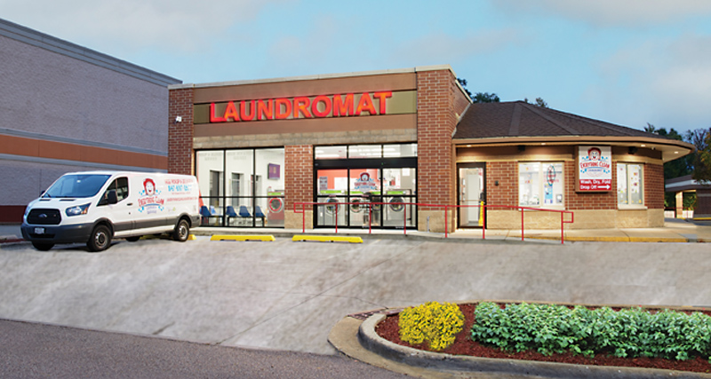
Everything Clean Laundromat
Elgin, Ill.
It’s extremely important to have good curb appeal. It shows what your customers will be stepping into. It allows your customer base to know that they’ll be entering a friendly, safe, and clean environment. We want our customers to have a full experience and to feel that we offer the best, cleanest, and most welcoming business to ease the burden of their laundry tasks.
I would suggest having large windows to display your laundry equipment to show that you can handle your customers’ laundry needs. Incorporate color in the background with an attractive, eye-catching design near the main entrance. Of course, keep your exterior swept and clean with no trash outside and a well-landscaped look.
Lighting is key. People need to see that they’re safe and able to move about in all areas of the laundromat. In addition, your color scheme should match your logo profile. Throw some color around so that your customers feel at home, and not like they’re in some locked, staid institutional setting. Also, be sure your exterior signage is as large as possible. Use this signage to let customers know what you do and who you are – and include your brand, because it helps customers find you more easily.
Let the customers look in, the more inviting your storefront the better to capture those prospective customers. At Everything Clean, we have clearly defined entry point, with two sliding doors and a side door for our drop-off service.
With regard to parking, we’re an independent location, so we have 20 parking spaces directly in front of the entry areas and more than 40 spaces overall. And we configured the storefront to ensure five or six spaces directly located at each entry point. We looked at our business from the perspective of the customer, rather than trying to see how much money we could save.
Design Tips: Your design should attract your customer base by showing off your laundromat and the equipment you have to service the consumer. You need to make sure that potential customers understand that the business is a laundromat – and that should be clearly displayed on the largest of your exterior signs. You can incorporate your specific brand inside the store – on your walls, etc.
Best Advice for Other Laundry Owners: Many laundromat owners worry only about the interior of their stores, and they don’t focus on any details regarding the exterior. Develop an open, inviting picture of what your customers will be coming into. Show them a friendly environment.
Jamie Sewell
Clean Vibes Laundry Company
Tampa, Fla.
It’s critical to have a great-looking and welcoming storefront for any retail business – laundromats are not exempt from this. We are all visual creatures first. A picture paints a thousand words and can instantly communicate some of the benefits of your store – cleanliness and safety being two of the biggest ones.
Just being able to see your laundromat from the street should be your number-one goal. Sometimes this gets overlooked, and it can cost you for the lifetime of the business – both in terms of how much money you need to spend in marketing dollars, and also in lost, organic revenue.
After visibility from the street, focus on good lighting, ample store signage (both on the road and above your business), fresh building paint in pleasing colors, and a clean parking lot.
Ample lighting in the parking lot and around the store will help people feel safe. Less critical but certainly important, color schemes and signage are reflections of your business’ brand. You need to think about how you want your business to make your customers feel.
If safety is a given, what are other brand promises do you want to communicate to your customers? You might want them to feel warm and cared for – Starbucks is a good example of this with its warm green and brown tones. Perhaps you want them to feel fresh or clean, in which case, whites, seafoam and blue colors will work best. Or maybe you want them to feel happy, thus possibly opting for bright pinks and blues.
Color theory is an art, so if you want to deliver a modern laundromat experience, start by deciding how you want customers to feel, and then you’ll have a good idea of what colors to use. Clearly, hiring someone to help you build your brand also can help.
I’m in the process of building my second laundromat brand. At this point, not all of my exterior choices have been made. For this brand, I’ve opted to use predominantly coral and green, which are not typical laundromat colors; however, being in Florida, I wanted to communicate vibrant feelings of happiness, fun, and freshness. I’m using coral-colored exterior signs and selected fonts that stand out but are clean (a key value proposition). I’ve removed the previous signage from the windows (a lot of bubbles and words) and will replace it with some icons and clean lettering that communicates my services and amenities. When it comes to branding, less is usually more.
This also was reflected in my first laundromat. The windows were clean, with just a few key posters hanging in the windows. It’s important to not clutter up your windows for safety reasons and because it will help your brand to feel clean. Customers need to be able to easily see in and out of your windows.
Since I just recently acquired my current store, I haven’t focused on the parking lot yet, but I will be working to get it resurfaced and repainted. I also will be adding a brightly painted bike rack, because I have a lot of customers who ride bikes.
My area has grown a lot over the last few years, and “rough” areas are quickly being upgraded. It’s important to know where your area is headed and to modernize your storefront based on those trends. In my case, clean and modern aesthetics are the trend.
Design Tips: Keep your branding clean and simple. Use bright colors selectively to help catch attention. Hanging a few posters in your windows is an excellent (and budget-friendly) way to highlight your key services and value props.
Incorporating key design elements into your storefront will give the brand more continuity and add visual interest. For example, if you have a washer icon in your logo, you might be able to incorporate that into a vinyl graphic on your windows. Working with a graphic designer is your best bet to get these details right.
Best Advice for Other Laundry Owners: Hire a designer to help you build your brand and upgrade your storefront. While you cannot calculate a direct ROI because of your branding, it will make all the difference and will help you scale your brand across multiple stores later on.
Max Sabo
Brax Laundry
Oregon City, Ore.
I attribute most of our success as a community laundromat to our storefront. Our building is 100 feet long and faces one of the busiest streets in our city.
We remodeled our storefront right after buying the building. We worked with an architect to design a new storefront, and he gave us the great idea of creating a parapet wall that created a large presence, and space for our signage. Now, it’s hard to miss Brax Laundry when driving past.
Clean, colorful and convenient at the keys for curb appeal. We all judge the inside of an establishment by its outside appearance. While this is especially true for food establishments, it applies to laundromats, too. Not many people want to do their laundry in a rundown, dirty store.
It’s important to keep the outside clean and safe. We regularly pick up trash in our parking lot, and make sure any potholes are repaired immediately Plan on re-striping your parking spaces every one to two years. Those painted lines don’t last forever.
It took my partner and me several months of visiting laundromats and other retail businesses to decide on our color scheme and exterior architecture. To get inspiration and see the new trends in store design and materials, we looked at national food chains. Colors, materials and design of fast-food and fast-casual restaurants have changed a lot in just the last two years. Bright and clean colors are in, as well as colorful LED lighting integrated into the building’s façade.
A lot of fast-food places and retail shops are getting an exterior face lift. Designs are minimalist and sleek, using near-white colors, contrasting with dark earth tones or a brand’s signature color. Gone are the days of dazzling bright oranges, reds, and yellows.
In the end, we decided on bright blue, with a little white and black. These are colors we think represent a clean and modern laundromat, and we’ve incorporated them into our brand and logo. We were thrilled to paint over the drab olive color that’s been on the building since the 1980s.
It would have been much less expensive to keep the double-swing doors at the front of our building. However, we knew customers want convenience, especially when carrying heavy loads of laundry in and out of our store. So, we hired an engineer to create a gravity frame design, a mason to enlarge the door opening, and a welder to install the gravity frame, a door company to install a sliding glass door, and lastly an electrician to wire up the new door. Our new sliding glass door wasn’t cheap, and it took about six months, but I would do it again because our customers love the fact they don’t need to struggle with doors when bringing in their laundry.
Design Tips: For most locations, new paint can create the biggest change. Paint color will fade over time, so even if you like the current color, you may want to invest in a new coat to bring it back to its original hue.
Be sure to look at your storefront during the day and at night. Storefronts that look inviting during the day may look dark and uninviting at night. LED lighting is an inexpensive way to make sure your customers want to visit your store, even when it gets dark early during the winter months. You may even get a rebate for installing new LED lighting.
If you don’t already have a color scheme, create one. You’ll use this color scheme for your logo, interior and exterior paint, signage, and packaging. Your color scheme is part of your identity. It’s what your customers will associate with your business.
Even if you lease your building, you can incorporate your color scheme into your business sign, and any other signage on your windows or doors. Your color scheme can tie your outside storefront to your interior and brand.
No doubt, decorators and architects can help you create your color scheme. Or you can do what we did and create your color scheme on your own, with free, online color pallet generators. For instances, we used www.coolors.co to pick three colors for the Brax Laundry color scheme.
Just remember to adjust for color differences between what is displayed on a computer monitor and what is printed on packaging and paint swatches. We picked up a Pantone color book to help us translate screen colors to paint and print colors.
Best Advice for Other Laundry Owners: Go outside and take a hard look at the front of your store. Go across the street to look, so you can see the whole business. Is there trash; weeds; and sun-bleached walls, awnings, or signs? How does your parking lot striping look? Are your windows clean and unobstructed? Can you see the brightly lit interior?
Some of the most important fixes to the outside of your store may not cost much at all. Paint, pulling weeds, sweeping, washing windows, and installing a floodlight can really improve the impression your customers have of your business – even before they walk in the front door.

