

How to Make Signage an Essential Ingredient of Your Laundromat’s Marketing Strategy
Have you ever thought about how many signs you see in a given day? Likely, it numbers in the hundreds if you consider the signage on the internet, on buildings, on billboards, and in and on stores, as well as the signs on commercial vehicles like your pickup-and-delivery vans.
Clearly, signs are everywhere – and they should be an essential part of your laundromat’s promotional campaign.
What’s more, there’s a definite “psychology of signage design” – which includes a number of factors, right down the colors used in the signs. And, unfortunately, many advertisers completely ignore these critical aspects of sign creation.
Most signs are ineffective, because they’re psychologically incorrect and don’t convey the intended message. Often, the location, wording or size of the signs simply make the targeted audience work too hard to read them.
For example, I recently noticed a sign in the window of a laundromat on a busy street that was obviously intended to target passing traffic. However, the print on the signs was no larger than a few inches in height and located at the bottom of the window directly adjacent to the laundry’s parking lot – and truly only visible to the occupants of the first row of cars in the lot. I can’t imagine what the store owner was thinking, inasmuch as he or she was, in essence, advertising to customers already utilizing the laundromat.
Another example I ran across not too long ago was a laundry owner whose pickup-and-delivery van signage featured print so small that it was virtually impossible for those in other vehicles to read. As it turned out, the reason for this impossible-to-read signage was due to the owner’s frugality. In other words, he just didn’t want to spend the money for larger print.
I’ve also seen advertising on vehicles where the names of the companies are large enough to read, but nothing else – so no one can tell what products or services those companies actually provide.
Follow the Rules
There are some basic rules of signage that will elicit the best and most economically sane results:
- Use color and images to attract readers’ attention.
- Make it readable by using easy-to-read fonts. Avoid cursive and other more difficult-to-read typefaces.
- Keep your signage legible, and mix up those ingredients from time to time.
Color psychology plays an important role in developing successful signs. This is because colors, when utilized properly, shape our thoughts, feelings and emotions. In fact, research has proven that color is responsible for as much as 80 percent of a person’s change in motivation when it comes to advertising and marketing campaigns.
While growing up, the signs I remember most and the ones that always left an impression on me were the Burma-Shave shaving cream ads along the sides of highways. These signs first appeared on Highway 65 near Lakeville, Minn., in 1926 and remained popular and in use until 1963. They were poetic and ingenious in the way they held the reader’s attention until the end.
Not only were the colors ideal but they were totally amusing, and Burma-Shave changed them often to keep up interest. Additionally, highways typically were only two lanes at the time, one in each direction – which meant the traffic in both directions could read the signs easily.
Back then, speed limits also were lower, so motorists had time to read them.
In today’s world of multi-lane highways and much higher speeds, the Burma-Shave ads along the sides of the road have disappeared.
The concept was that each “poem” would feature six separate signs, and each sign was situated about 50 feet ahead of the previous one so that the reader could easily observe each one to eventually fully comprehend the entire poetic sales message.
As I mentioned, color choice is extremely important with regard to the psychology of advertising. Color psychology is a natural phenomenon that we relate to with different feelings. In fact, the actual representation of a word or image is enhanced when combined with colors.
To attract customers, using the correct combination of colors for your signage is essential. Given that, let’s examine the impact of various colors on the perception of your laundry business by prospective customers. And let’s see how effective colors can be with regard to your signs.
The Psychology of Color
Your sign will be good when it’s visible; impacts the eye; and defines your brand, product or service. This applies to channel letters, wall graphics, LED signs, banners, posters, lettering on vehicles, billboards and on and on. It’s all about combining the right colors that impact the target in a proper psychological manner.
So, here’s how specific colors affect the human psyche.
White: In color psychology, white signifies peace, calmness and a new beginning. The color white, combined with properly sized lettering, will offer up a new, pure feeling. However, too much use of white, with the wrong sized lettering, can take up a sign’s “breathing” space.
Black: When black is used against the right backdrop, any information, name or idea can appear mysterious, alluring and chic. Also, directional and instructional signs in big, bold, black letters are easier to spot and tend to be seen as more helpful.
Red: This color signifies excitement. Used in interior signage, red can be used to share the very latest information with your customers. However, red also can feel overwhelming for some and, if your business doesn’t feature a variety of colors, balancing red can become confusing. In these situations, you can add red in posters, banners and signage types, which aren’t necessarily permanent.
Blue: Different shades of blue signify different emotions. From sky blue to aqua to royal blue, these variations can set the mood from slow and calm to energetic and vibrant. Having signs in blue can work more so for the interior of your laundry business and can boost employee morale. Moreover, customers most likely will feel more at ease with information that’s provide in blue. It’s the color that almost everyone likes.
Gray: Signs in gray are considered chic and modern, yet they clearly require a vibrantly colored background in order to help the information “pop.” Gray is considered a rather “safe” color, but signs in gray often can get lost in areas that don’t have anything else going on that’s visually interesting. For gray to stand out, you’ll need to add such features as an image, elaborate background or lighting to make these signs properly visible.
Colors are critical because signs are all about sending messages. Research has shown that gray against a complex backdrop, red in a chic and simple background, and black with lighting against any type of backdrop are highly effective. This is because all of those combinations are visible at first sight, and you can mix and match in order to determine the actual visibility of different color combinations.
Colors are related to moods and subconscious feelings. As a result, they can be highly influential when it comes to the decision-making process of the viewers.
Many entrepreneurs use colors to express their businesses through their signage. However, things can go wrong if the mood is mismatched. A few obviously over-the-top examples of “mismatched signs” would be large flashing neon signs in a library, which clearly would be too overwhelming, or tiny and nearly unreadable signage designated to convey directions or other important information.
Many customers remember a restaurant that displays good ambiance because, for them, it’s all about the experience. With your store’s signs, you should aim for the type of signage that depicts the true nature of your business. Interior signs should be welcoming and helpful – and exterior signs should display your brand, stand out and attract those passing by your laundromat. As we’ve discussed, the colors of your signs very often will do half the work in helping to create a lasting impression of your business.
With regard to the signage on your pickup-and-delivery vehicles, I’ve taken it upon myself to do a bit of a research lately to test my hypothesis that most business owners have a good understanding of their products and services – but, alas, not much understanding at all of how to design signage on their delivery vans, especially given the short exposure time to the viewer.
No one expects you to be an expert in the field of color psychology. However, as long as you’re utilizing signage that moves, it’s a good idea to develop an understanding of the importance of the design of your “mobile advertising.”
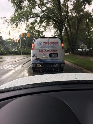
While driving, I’ve taken a few photographs of commercial vehicles:
 This is an example of what I would consider a nicely thought-out vehicle display. The colors are mixed appropriately. The graphics tell the story well. And the contact number is large and well-displayed. There is no question who they are, what they do and how to contact them.
Unfortunately, in this next photo, I can’t pay this company the same compliment. First of all, there’s too much red in the design, which creates more of an alarm than an announcement. But the biggest mistake is over-accentuating the name of the company (who really cares?) and under-promoting what the company actually does – which is plumbing, heating and cooling. Plus, the graphic is way more abstract than relevant.
 When designing vehicle advertising, it’s not the time to economize, with the intent of reducing your costs by using extremely small print and/or just one color. If done properly, vehicle advertising can become a significant ingredient of your overall marketing program.
As previously mentioned, I was always so impressed with the Burma-Shave poems, so I thought it appropriate to pay poetic homage to this most creative company by ending this column in the Burma-Shave fashion while also reiterating my takeaway message to you…
In Today’s Competitive World,
Laundry Owners Should Be Scholars,
And Not Trip Over Pennies,
On Their Way To Dollars.